It's hard enough these days to get customers to visit your site; it's even trickier to keep them on it. A customer can leave a site for several reasons: She may find the design unappealing, the content hard to read, or simply may not find the information she was looking for. Unfortunately, Baskets and Blossoms suffers from all of these conditions.
Navigation
Starting on a positive note, I do like the fact that the navigation is categorized into a “shop by selection” format. I also like the fact that some of the other key sections are highlighted through the top navigation. However, the top navigation is barely visible due to the dark color scheme.
Although the left nav is more appealing, it lacks in usability. If you click on a component in the left nav, you are brought to another section of the same page; in this regard, you are not able to view the navigation options from most sections. Ultimately, this causes you to leave the site if you're not interested in what you're viewing.
The designers try to compensate for this by providing "back to top" links at the end of each section; however, this creates an extra step for the user. In addition, clicking one of these links doesn't take the visitor to the top of the page -- it only takes her to the beginning of the "Shop by Selection" navigation, causing her to miss the entire top navigation.
Images
Perhaps even more repelling than the navigation is the animated image of the dancing roses at the top of the page. In order to convey added appeal, animated images must be used very carefully in web design. In this case, the image is distracting and compromises the professionalism of the site.
A general issue with the images is that they are low resolution; this includes the company's logo, which should by nature be visually appealing. Not to mention, most of the pictures are too small. The customer does not have the ability to zoom in, and some items (like “Teatime”) do not even have pictures.
Font
Apart from the navigation and images, the font could use some work. It's a known fact that bold, italics, and underline are all great tools for highlighting important text; when used together, however, the text appears unprofessional. This is the case with the text at the top of the page. Font size is also an issue, most notably in the text below the address on the left.
If Baskets and Blossoms improved in even a couple of these areas, I'm sure they would see considerably higher conversion rates. It's true that the company isn't nearly as big as ftd.com or 1800flowers.com -- but if they don't follow these basic design principles, they never will be.
Showing posts with label usability. Show all posts
Showing posts with label usability. Show all posts
Sunday, February 22, 2009

Thursday, February 5, 2009
Reverse Wireframe Creation for Chatham University's Homepage
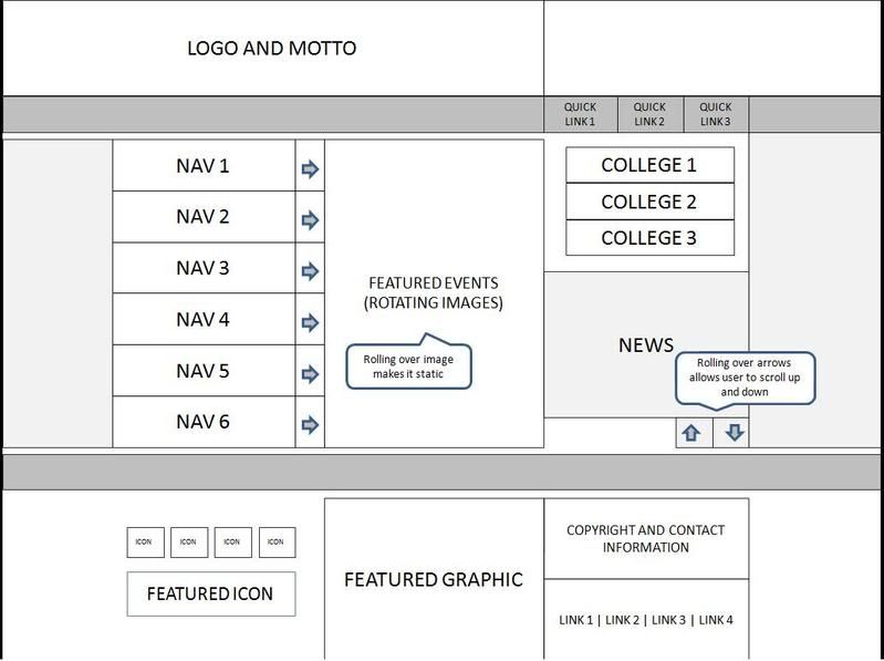
Over the past couple of days, I've created a "reverse wireframe" for Chatham University's Homepage. This basically involved studying the structure of the page and replicating the main aspects of it in a "barebones" manner. The process is great practice for understanding the objectives and functionality of a Web page. Although the layout largely matches that of the current site, I modified the structure of some elements slightly (in order to be more realistic), For example, I left out the Princeton Review ad at the upper right, portrayed six left navigation categories instead of nine, four left footer links instead of five, etc. The process was very enlightening for me, and I definitely appreciate the role of the information architect more after this process! If you want to see more detail, you can view the full size wireframe.

Friday, January 16, 2009
Eye tracking studies on news sites -- interesting findings
It was very enlightening to read the eyetracking study on http://poynterextra.org/eyetrack2004/main.htm. This study tracked the eye movements of 46 people over one hour, as they viewed "mock" news sites. Although it’s no surprise that the visitors of a web page initially focus on the upper left portion of a web page, that top navigation performs best, and that larger photos are viewed more often, there are a few things I read which surprised me:
• Text trumps photographs when it comes to both order viewed and eye fixation
• Smaller font encourages users to read more
• Blurbs below headlines are often ignored, especially if headlines are on a separate line, bolded and/or underlined
• People tend to read content lower on the page only if there is something particularly attention-grabbing, i.e. a familiar name, something controversial, or something that appeals to the senses
• Right-hand navigation doesn’t compromise usability
• Paragraphs containing 1-2 sentences have a considerably higher readership than longer paragraphs
• Banner ads at the top and right of a page receive only modest views
• Users often click on photos, even if they are not “clickable”
There are many practical real-world applications from this study. These applications are not limited to news sites, and can pertain to virtually any site. Of course, retail sites have some marked differences, like using fewer “blurbs” and less text content. However, retail sites still use headlines, product descriptions, images, site navigation, and content “below the fold.”
It’s amazing how all these “little things” can make such an impact on usability and retention.
• Text trumps photographs when it comes to both order viewed and eye fixation
• Smaller font encourages users to read more
• Blurbs below headlines are often ignored, especially if headlines are on a separate line, bolded and/or underlined
• People tend to read content lower on the page only if there is something particularly attention-grabbing, i.e. a familiar name, something controversial, or something that appeals to the senses
• Right-hand navigation doesn’t compromise usability
• Paragraphs containing 1-2 sentences have a considerably higher readership than longer paragraphs
• Banner ads at the top and right of a page receive only modest views
• Users often click on photos, even if they are not “clickable”
There are many practical real-world applications from this study. These applications are not limited to news sites, and can pertain to virtually any site. Of course, retail sites have some marked differences, like using fewer “blurbs” and less text content. However, retail sites still use headlines, product descriptions, images, site navigation, and content “below the fold.”
It’s amazing how all these “little things” can make such an impact on usability and retention.
Subscribe to:
Posts (Atom)