Thursday, February 5, 2009
Reverse Wireframe Creation for Chatham University's Homepage
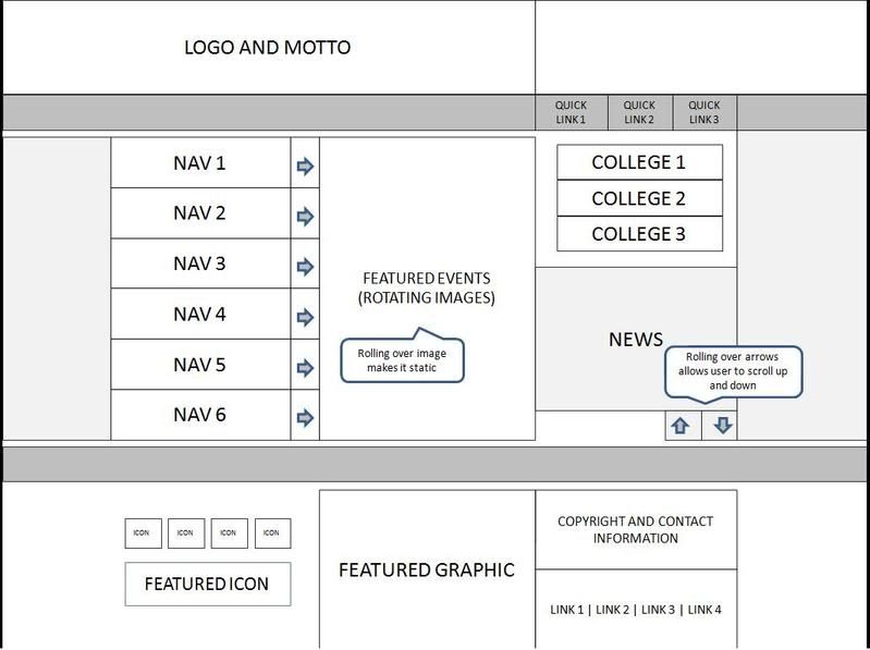
Over the past couple of days, I've created a "reverse wireframe" for Chatham University's Homepage. This basically involved studying the structure of the page and replicating the main aspects of it in a "barebones" manner. The process is great practice for understanding the objectives and functionality of a Web page. Although the layout largely matches that of the current site, I modified the structure of some elements slightly (in order to be more realistic), For example, I left out the Princeton Review ad at the upper right, portrayed six left navigation categories instead of nine, four left footer links instead of five, etc. The process was very enlightening for me, and I definitely appreciate the role of the information architect more after this process! If you want to see more detail, you can view the full size wireframe.

Wednesday, February 4, 2009
The "Personal" Element of Myspace
According to a recent TechCrunch article, there are close to 60% more unique visitors on Facebook than there are on Myspace. I think Facebook’s interactive elements – including news feeds, easy-to-use status updates, and multitude of applications – play a significant role in driving more users. While Myspace has introduced similar features, they are clearly still trying to “catch up” with Facebook in this regard.
However, I do think Myspace does a better job with the "personal" element. Users are able to choose their own background and music for their profiles. For me, this is a huge bonus. I am creative by nature, so I enjoy playing around with different layouts and changing my music on a regular basis. Furthermore, Myspace allows the use of HTML and CSS for profile content and design. This is the feature I like the most. As a member of the Myspace community, I want my profile to say something about me. Sure, I have a say in how my Facebook profile looks too, but I don’t have nearly as much control over the look and feel as I do in Myspace. Actually, most Facebook profiles start looking the same after a while.
Finally, although it may seem a little archaic, I actually enjoy Tom’s (the founder) regular updates – even when he writes just to inform his users of glitches in the system. I like the fact that someone from the organization cares enough to communicate with me and keep me informed, on an almost personal level.
There's a fine line between being interactive and being personal, but Myspace does a good job at incorporating both.
However, I do think Myspace does a better job with the "personal" element. Users are able to choose their own background and music for their profiles. For me, this is a huge bonus. I am creative by nature, so I enjoy playing around with different layouts and changing my music on a regular basis. Furthermore, Myspace allows the use of HTML and CSS for profile content and design. This is the feature I like the most. As a member of the Myspace community, I want my profile to say something about me. Sure, I have a say in how my Facebook profile looks too, but I don’t have nearly as much control over the look and feel as I do in Myspace. Actually, most Facebook profiles start looking the same after a while.
Finally, although it may seem a little archaic, I actually enjoy Tom’s (the founder) regular updates – even when he writes just to inform his users of glitches in the system. I like the fact that someone from the organization cares enough to communicate with me and keep me informed, on an almost personal level.
There's a fine line between being interactive and being personal, but Myspace does a good job at incorporating both.
Tuesday, February 3, 2009
Wal-Mart in Top 10 Searches
Every now and then, I venture out and look at the top search terms for the past month or two. Although my customers are largely affiliated with the military, this information ensures that I am familiar with current trends. I usually refer to Hitwise, since it is a reliable source with tons of useful data. Here are the top ten terms Americans searched for in December 2008:
1. myspace
2. craigslist
3. ebay
4. youtube
5. facebook
6. myspace.com
7. walmart
8. yahoo
9. mapquest
10. amazon
As you can see, new media sites are gaining major territory. The top players have remained largely the same for the past several months, which is no surprise considering the growing popularity of these types of sites.
Perhaps the term that stands out the most is “walmart.” Wal-Mart’s online presence is only soaring, due to the great bargains offered by the retailer in light of today’s economy. Furthermore, the company is building a connection with its audience through its product reviews, Facebook page, and "online consultant panel" (composed of real shoppers who regularly provide feedback on the company's products and services). Wal-Mart even has an iPhone application, which allows customers to see if a certain product is available at a local store, and view pricing and ratings for that product.
It's features like these that will play a major role in keeping Wal-Mart in the top 10 searches for a long time.
1. myspace
2. craigslist
3. ebay
4. youtube
5. facebook
6. myspace.com
7. walmart
8. yahoo
9. mapquest
10. amazon
As you can see, new media sites are gaining major territory. The top players have remained largely the same for the past several months, which is no surprise considering the growing popularity of these types of sites.
Perhaps the term that stands out the most is “walmart.” Wal-Mart’s online presence is only soaring, due to the great bargains offered by the retailer in light of today’s economy. Furthermore, the company is building a connection with its audience through its product reviews, Facebook page, and "online consultant panel" (composed of real shoppers who regularly provide feedback on the company's products and services). Wal-Mart even has an iPhone application, which allows customers to see if a certain product is available at a local store, and view pricing and ratings for that product.
It's features like these that will play a major role in keeping Wal-Mart in the top 10 searches for a long time.
Thursday, January 29, 2009
Coworking as a Form of Groundswell
My friend recently alerted me to a place called IndyHall. He sent me a link to their Twitter profile, which has almost 600 followers. IndyHall is an organization in Philadelphia built around the notion of coworking – which is still fairly new to me. According to Wikipedia, coworking is defined as the following:
“…an emerging trend for a new pattern for working. Typically work-at-home professionals or independent contractors or people who travel frequently end up working in relative isolation. Coworking is the social gathering of a group of people, who are still working independently, but who share values and who are interested in the synergy that can happen from working with talented people in the same space.”
Although some coworking facilities are paid for by the organizers, there is a charge to use the facilities at Independent’s Hall. The fee ranges from $25/month to $275/month, depending on frequency and duration of visits as well as workspace and equipment needed. For those who can afford this, it seems like a promising deal. Coworking taps into the concept of Groundswell, which is basically the idea of people using technologies to get what they need from each other instead of from traditional institutions. It involves participation, collaboration, and the use of social technologies to create a network of minds that is collaboratively greater than the sum of its parts.
If and when I do become a freelancer, I would love to be involved in a community like IndyHall. Until then, I plan to use both Twitter and Indy Hall's web site (which has a blog as well as a wiki) to become more familiar with the coworker lifestyle.
“…an emerging trend for a new pattern for working. Typically work-at-home professionals or independent contractors or people who travel frequently end up working in relative isolation. Coworking is the social gathering of a group of people, who are still working independently, but who share values and who are interested in the synergy that can happen from working with talented people in the same space.”
Although some coworking facilities are paid for by the organizers, there is a charge to use the facilities at Independent’s Hall. The fee ranges from $25/month to $275/month, depending on frequency and duration of visits as well as workspace and equipment needed. For those who can afford this, it seems like a promising deal. Coworking taps into the concept of Groundswell, which is basically the idea of people using technologies to get what they need from each other instead of from traditional institutions. It involves participation, collaboration, and the use of social technologies to create a network of minds that is collaboratively greater than the sum of its parts.
If and when I do become a freelancer, I would love to be involved in a community like IndyHall. Until then, I plan to use both Twitter and Indy Hall's web site (which has a blog as well as a wiki) to become more familiar with the coworker lifestyle.
Sunday, January 25, 2009
Reaching Out to Healthcare Consumers
I’ve been reading Groundswell lately, and have really been enjoying it. There’s so much I can relate to from an Internet Marketing perspective. I recently completed Part I, which did a great job of summarizing how consumers are using social technologies in a way that is greatly impacting, and in a sense controlling, organizations. I especially liked reading about the social technographics profiles businesses can create to target their users, and what social technologies would best suit each profile.
One of the observations the authors make is the strict regulatory compliance healthcare companies face when it comes to using these social technologies. As someone who’s worked with many pharmaceutical clients (during my work at Razorfish), I’ve experience firsthand what a challenge this can be. From a web content standpoint, pharmaceutical companies are already restricted to what claims they can make regarding their products – for example, one company I worked with had a requirement that stated it could only use the phrase “prevent” if it was preceded by “helps.” As far as making their sites more interactive, many of these companies are forced to use “unidirectional” interactive features like videos, questionnaires and stories of satisfied users sharing their experiences. I think it’s great that sites like MyAlli.com and Dailystrength.com have recently started to break that mold by including discussion forums on their sites. Nevertheless, the forums must still be very closely monitored for medical recommendations posted by users, negative feedback, etc.
A great outlet for companies who are not able to utilize “bidirectional” features like blogs and forums – due to government regulations, lack of human resources, or for other reasons – is the microsite. A microsite is essentially an extension of a company’s main web site, branded or unbranded, dedicated to a related cause and designed for community appeal. For example, www.inyourcorner.com was designed by AstraZeneca as a support site for women with breast cancer; at the same time, it clearly promotes the drug Arimidex.
Some related thoughts are posted in the article I wrote for Ad News/Philly Ad Club.
One of the observations the authors make is the strict regulatory compliance healthcare companies face when it comes to using these social technologies. As someone who’s worked with many pharmaceutical clients (during my work at Razorfish), I’ve experience firsthand what a challenge this can be. From a web content standpoint, pharmaceutical companies are already restricted to what claims they can make regarding their products – for example, one company I worked with had a requirement that stated it could only use the phrase “prevent” if it was preceded by “helps.” As far as making their sites more interactive, many of these companies are forced to use “unidirectional” interactive features like videos, questionnaires and stories of satisfied users sharing their experiences. I think it’s great that sites like MyAlli.com and Dailystrength.com have recently started to break that mold by including discussion forums on their sites. Nevertheless, the forums must still be very closely monitored for medical recommendations posted by users, negative feedback, etc.
A great outlet for companies who are not able to utilize “bidirectional” features like blogs and forums – due to government regulations, lack of human resources, or for other reasons – is the microsite. A microsite is essentially an extension of a company’s main web site, branded or unbranded, dedicated to a related cause and designed for community appeal. For example, www.inyourcorner.com was designed by AstraZeneca as a support site for women with breast cancer; at the same time, it clearly promotes the drug Arimidex.
Some related thoughts are posted in the article I wrote for Ad News/Philly Ad Club.
Tuesday, January 20, 2009
Kudos for the Multi-level Writing Model
I just finished reading http://www.e-gineer.com/v1/articles/web-writing-for-many-interest-levels.htm, which is a great article detailing the “multi-level” writing model. Basically, this model makes use of varied levels of information throughout the page, structured in a manner which maximizes scannability. The goal is to write in a way that makes it easy for a reader to determine their interest level.
This is a great article, and is immensely useful in capturing one’s target audience. Rather than “hold back” on less important information in order to make a page more concise, this method allows the user to choose how concise the page should be. The multi-level writer gauges their audience through the use of meaningful titles, one paragraph and one sentence summaries, headings with sub-anchors, bold font, topic sentences, and bullet points. One of the most interesting points in the article is what happens when a customer moves past these cues. Regardless of the writing structure and even the information the writer presents, it is the writer’s personal style which captivates the audience and draws them in. An informal tone, complemented with credibility demonstrated through links or other references sets the tone for user satisfaction.
The article placed particular emphasis on the use of effective titles, since this is often the first thing that both a user and a search engine see. From my experience in search engine optimization, I couldn’t agree more. One of the best ways to target your audience is through the use of relevant keywords in your title. Tools such as Wordtracker and the Google Adwords Keyword Tool help writers to assess the most highly searched terms in relation to any given subject. This is an extremely important step in studying the mindset of your customers, since it allows you to learn what they are searching for. Using the right terms not only increases natural search engine traffic on a page, but also ensures that the right people are visiting that page.
This is a great article, and is immensely useful in capturing one’s target audience. Rather than “hold back” on less important information in order to make a page more concise, this method allows the user to choose how concise the page should be. The multi-level writer gauges their audience through the use of meaningful titles, one paragraph and one sentence summaries, headings with sub-anchors, bold font, topic sentences, and bullet points. One of the most interesting points in the article is what happens when a customer moves past these cues. Regardless of the writing structure and even the information the writer presents, it is the writer’s personal style which captivates the audience and draws them in. An informal tone, complemented with credibility demonstrated through links or other references sets the tone for user satisfaction.
The article placed particular emphasis on the use of effective titles, since this is often the first thing that both a user and a search engine see. From my experience in search engine optimization, I couldn’t agree more. One of the best ways to target your audience is through the use of relevant keywords in your title. Tools such as Wordtracker and the Google Adwords Keyword Tool help writers to assess the most highly searched terms in relation to any given subject. This is an extremely important step in studying the mindset of your customers, since it allows you to learn what they are searching for. Using the right terms not only increases natural search engine traffic on a page, but also ensures that the right people are visiting that page.
Friday, January 16, 2009
Eye tracking studies on news sites -- interesting findings
It was very enlightening to read the eyetracking study on http://poynterextra.org/eyetrack2004/main.htm. This study tracked the eye movements of 46 people over one hour, as they viewed "mock" news sites. Although it’s no surprise that the visitors of a web page initially focus on the upper left portion of a web page, that top navigation performs best, and that larger photos are viewed more often, there are a few things I read which surprised me:
• Text trumps photographs when it comes to both order viewed and eye fixation
• Smaller font encourages users to read more
• Blurbs below headlines are often ignored, especially if headlines are on a separate line, bolded and/or underlined
• People tend to read content lower on the page only if there is something particularly attention-grabbing, i.e. a familiar name, something controversial, or something that appeals to the senses
• Right-hand navigation doesn’t compromise usability
• Paragraphs containing 1-2 sentences have a considerably higher readership than longer paragraphs
• Banner ads at the top and right of a page receive only modest views
• Users often click on photos, even if they are not “clickable”
There are many practical real-world applications from this study. These applications are not limited to news sites, and can pertain to virtually any site. Of course, retail sites have some marked differences, like using fewer “blurbs” and less text content. However, retail sites still use headlines, product descriptions, images, site navigation, and content “below the fold.”
It’s amazing how all these “little things” can make such an impact on usability and retention.
• Text trumps photographs when it comes to both order viewed and eye fixation
• Smaller font encourages users to read more
• Blurbs below headlines are often ignored, especially if headlines are on a separate line, bolded and/or underlined
• People tend to read content lower on the page only if there is something particularly attention-grabbing, i.e. a familiar name, something controversial, or something that appeals to the senses
• Right-hand navigation doesn’t compromise usability
• Paragraphs containing 1-2 sentences have a considerably higher readership than longer paragraphs
• Banner ads at the top and right of a page receive only modest views
• Users often click on photos, even if they are not “clickable”
There are many practical real-world applications from this study. These applications are not limited to news sites, and can pertain to virtually any site. Of course, retail sites have some marked differences, like using fewer “blurbs” and less text content. However, retail sites still use headlines, product descriptions, images, site navigation, and content “below the fold.”
It’s amazing how all these “little things” can make such an impact on usability and retention.
Subscribe to:
Posts (Atom)